Design Realisation Techniques
I'm quite excited about this module! I recon it might be a little intense though as we are expected to take in a new computer programme through each tutorial.
We were tough Adobe illustration today. I thoroughly enjoyed this tutorial! I've wanted to use this application for design for ages but I've never know where to begin. At the beginning of the day I found the pen tool a little frustrating as it was hard to generate curved lines through the use of anchor points. However as the day progressed and we experimented with various images I began to gain confidence.
I really like the overall image this application projects and can't wait to get adobe on my laptop so I can practice in my spare time!!
We have our DreamWeaver tutorial tomorrow, I am a little apprehensive about this one. Although I know we will only being tough the basics, I have a feeling we were going to be bombarded with complicated language and overloaded with information.
Well that wasn't as bad as I thought it was going to be!
I took ICT at A-Level, so I already had a basic understanding of how a website is put together. But with the subject being taught a number of years ago I couldn't remember everything.
This tutorial though did recall the information and so really in theory I wasn't taught anything new.
Now we are expected to go away and compile a website of our own. I think I shall construct one in which displays images of the work I generated last year. As well as include current projects, bibliography and contact information.
As I still don't have Adobe CS5 on my laptop yet I missioned into uni today. As I enjoyed the illustrator tutorial and I know it is one of those programmes that takes a while to get used to I thought I ought to practice a bit!
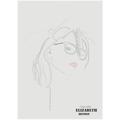
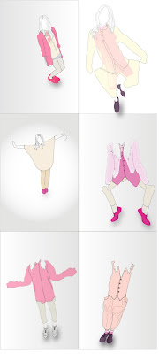
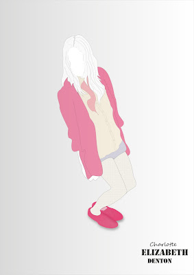
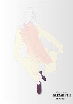
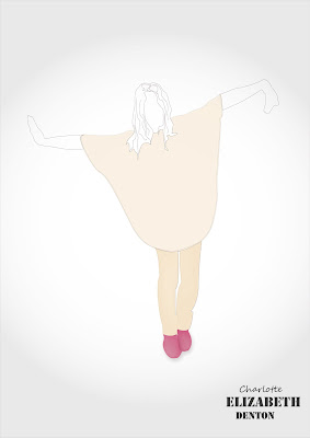
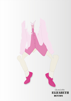
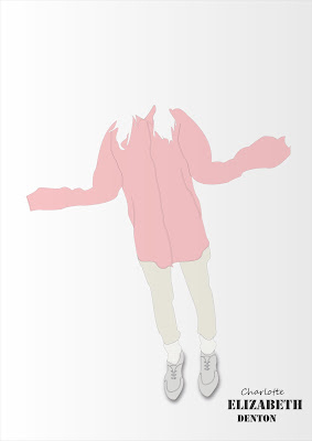
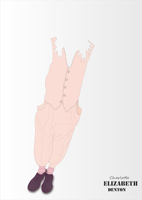
I generated a couple of images, thought they all need a lot of work doing to them to bring them up to a profession standard, i've found myself becoming more compitant at using the pen tool.
I've just had a quick read through the book 'The Adobe handbook for fashion Illustrator'. It pretty much covers the basics in which were were taught, however it showed me how to use the mesh tool.
I've started to use this feature a lot in my designs as it generates a suggestions towards a 3D image.

I need to start remembering to copy the outline first though as the mess tool removes this aspect.When working with flat drawing, I feel an outline to a fill provides a cleaner finish.
Although I had been shown the gradient tool, I hadn't considered using it when applying a colour fill to the buttons. This generated a metallic appearance and works really well!
I've also started using the drop shadow effect quite a bit. Again it's another feature in which helps to generate another dimention to design.
I'm happy with the compositions in which I have generated for my A3 portfolio. I fell I have demonstrated a wide range of varied techniques and followed through with my brand logo.
We had our Flash tutorial today. I has definately been the most testing out of the three. Its annoying how a slight typing error can completely screw up your entire animation!
The basic classic tween animation seemed relatively easy to work with and in my own time I decided to see how I could apply it to various images.
I wanted to make a bird fly across the stage. It took a while to do as each wing needed to be adjusted through numerous Key frames however I am happy with the end result.
Bruce offered the class a flash extension tutorial. Although no one else seemed interested I thought as I now have CS5 at home, I would take him up on his offer in order to benift my website.
Personally when looking through websites it annoys me when I have to scroll down for about ten minutes to find an image. So I decided when generating mine, through the use of flash I would provide the user with thumbnail versions of my work. These thumbnails would be buttons, so when clicked on a larger scaled version of the image would appear alongside.
The button process was harder to get my head round than the motion tween. There are so many more stages and layers that have to be taken into consideration. It took me an entire day to understand each process exactly, but after producing several pages and following a template step by step, I've finally got the hang of it.
Persistence paid off with experimentation as I am now happy with the final website. I wanted to produce a layout in which appeared relatively simple yet effective. Something that contained clear and precise navigation. Finally I didn't want anything that was to image heavy as I believe a more minimal approach works more successfully as the eye easily skims the page.
I am please with the final result. If given more time alterations would be made however in the time were were allocated I feel I have successfully presented a varied selection of acquired skills in this module.
Although these two weeks have been intense in relation to time spent on each application, overall I thoroughly enjoyed this module. I feel we were taught a varied number of technical skills and I am looking forward to taking them further in order to help me develop my personal design style.

No comments:
Post a Comment